Enki
A brand identity for the bridge between cultural events, audiences, and sponsors.
Overview
Enki connects the three sides of cultural life: events, the audiences who attend them, and the sponsors who make them possible.
The identity had to hold two moods at once: expressive enough for culture, precise enough for partners and data. One mark, three bold colors, and a system that flexes between the two.
Scope of work
- Logo and visual identity
- Color system with accessibility built in
- Typography and layout system
- Brand guidelines and applications
The mark
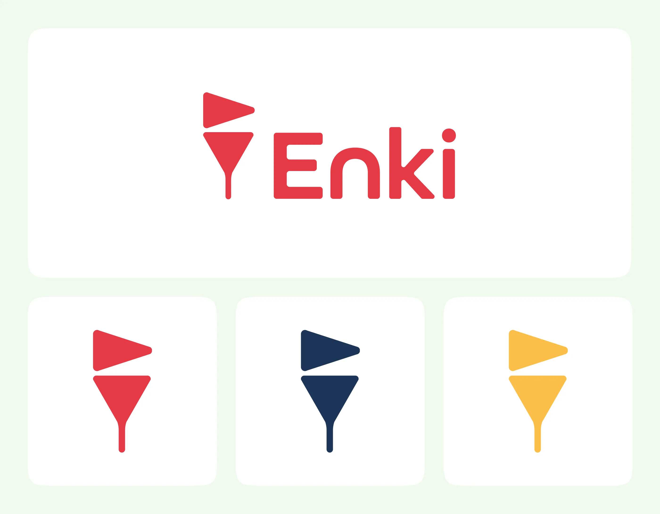
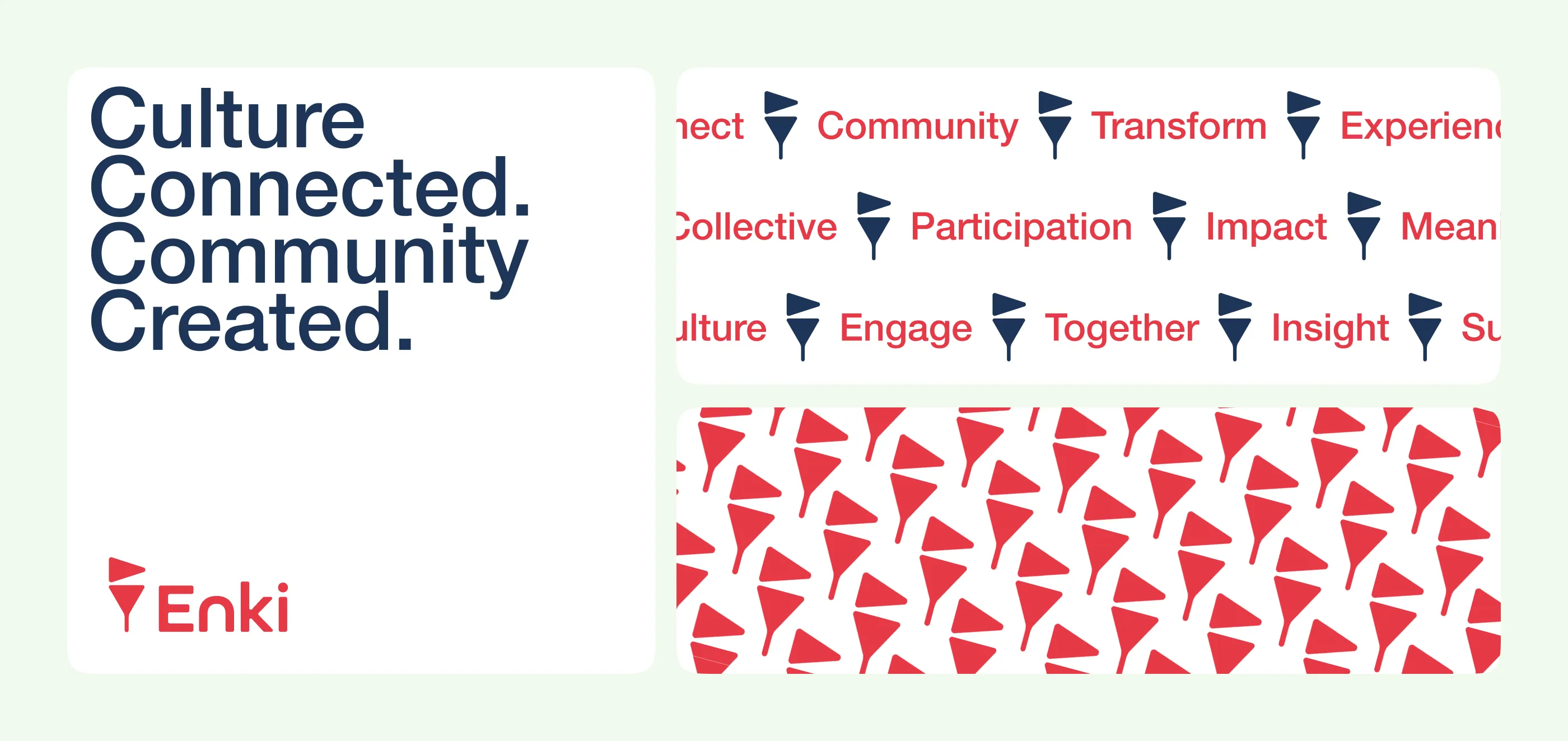
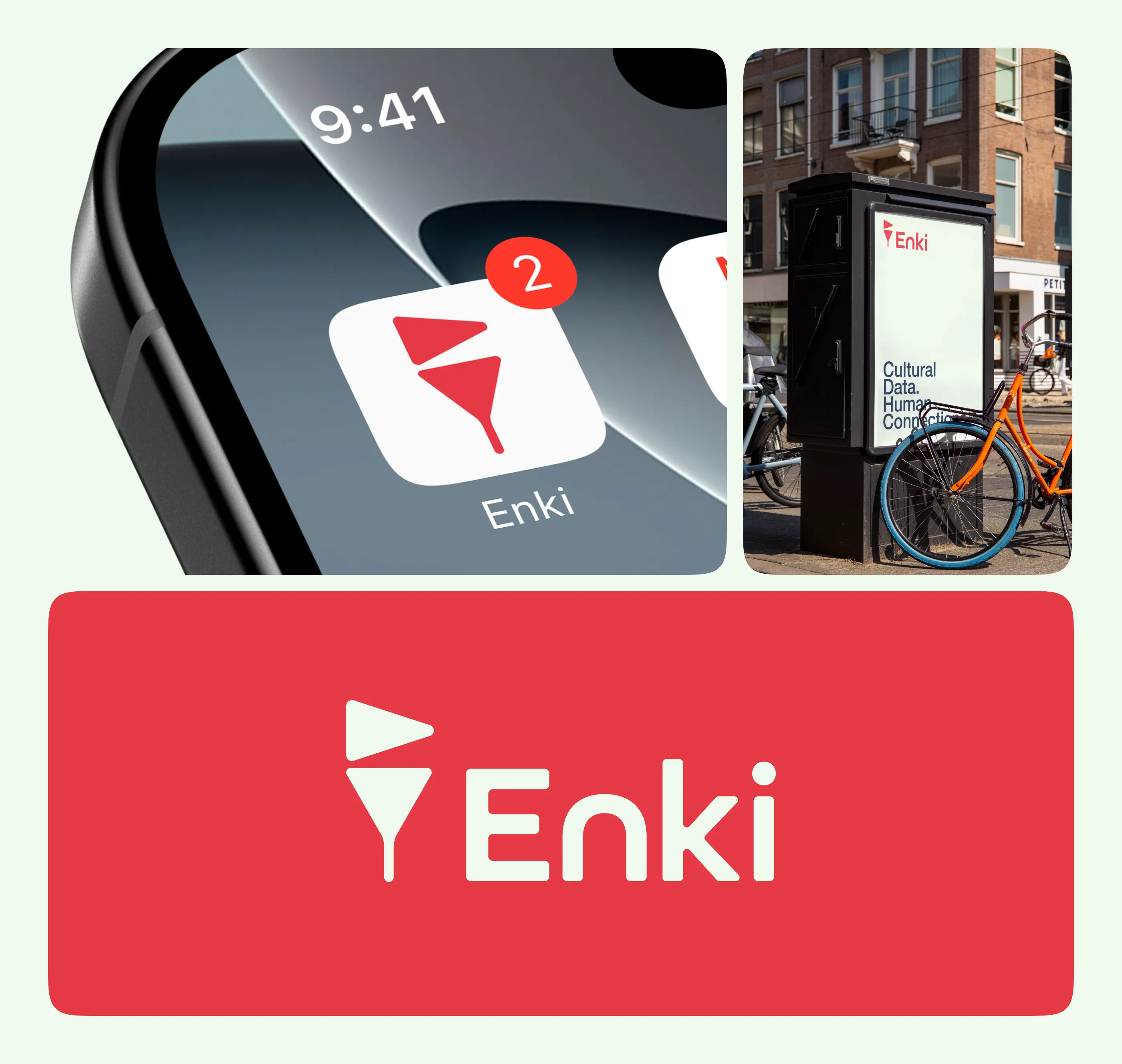
A pennant, caught mid-wave. It marks a moment the way a flag marks a stage: simple enough for a favicon, distinctive enough to become a pattern. Simplified one-color versions in magenta, teal, and yellow keep the system flexible.
Color and type
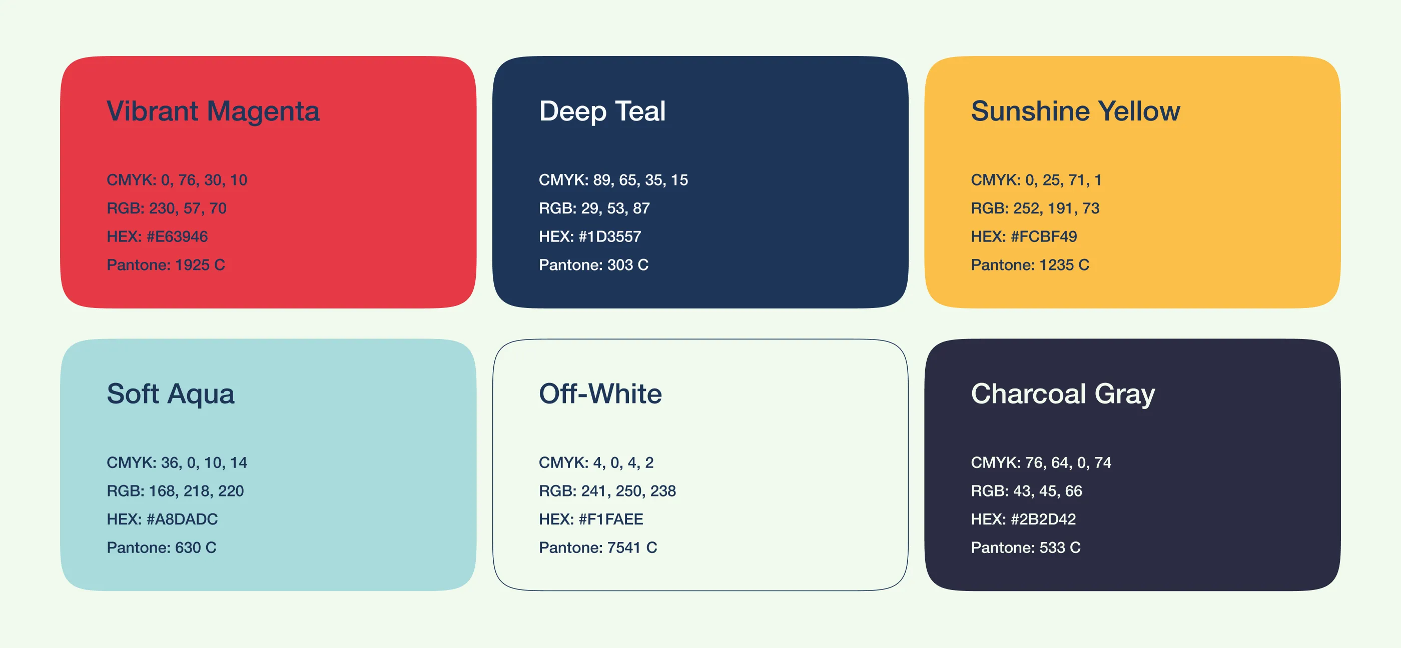
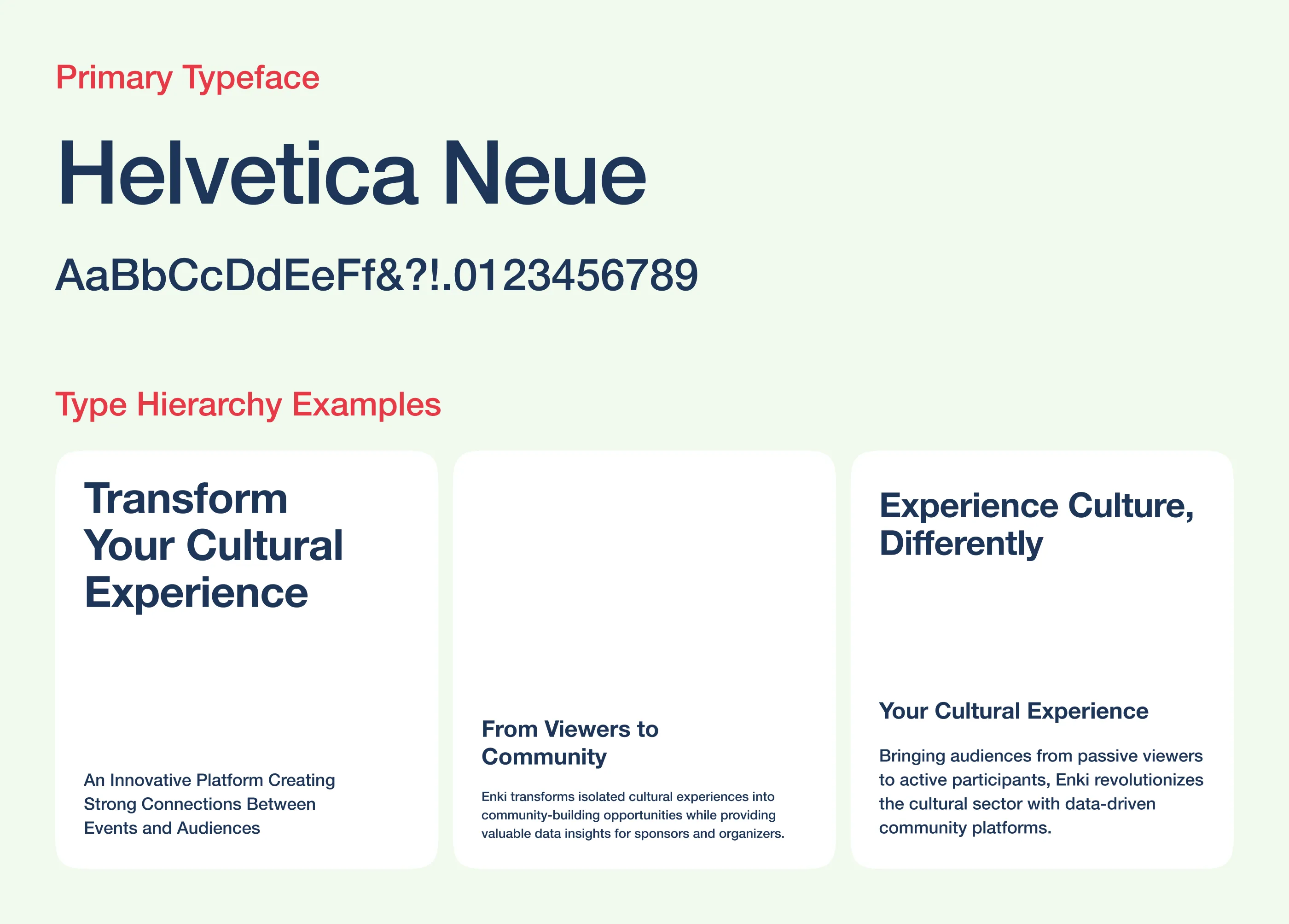
Three loud primaries, vibrant magenta, deep teal, and sunshine yellow, balanced by calm neutrals. Every combination was checked for contrast, most passing AAA, so accessibility is part of the identity rather than a patch on top. Helvetica Neue keeps the typography neutral and sturdy, and lets color carry the personality.
Applications
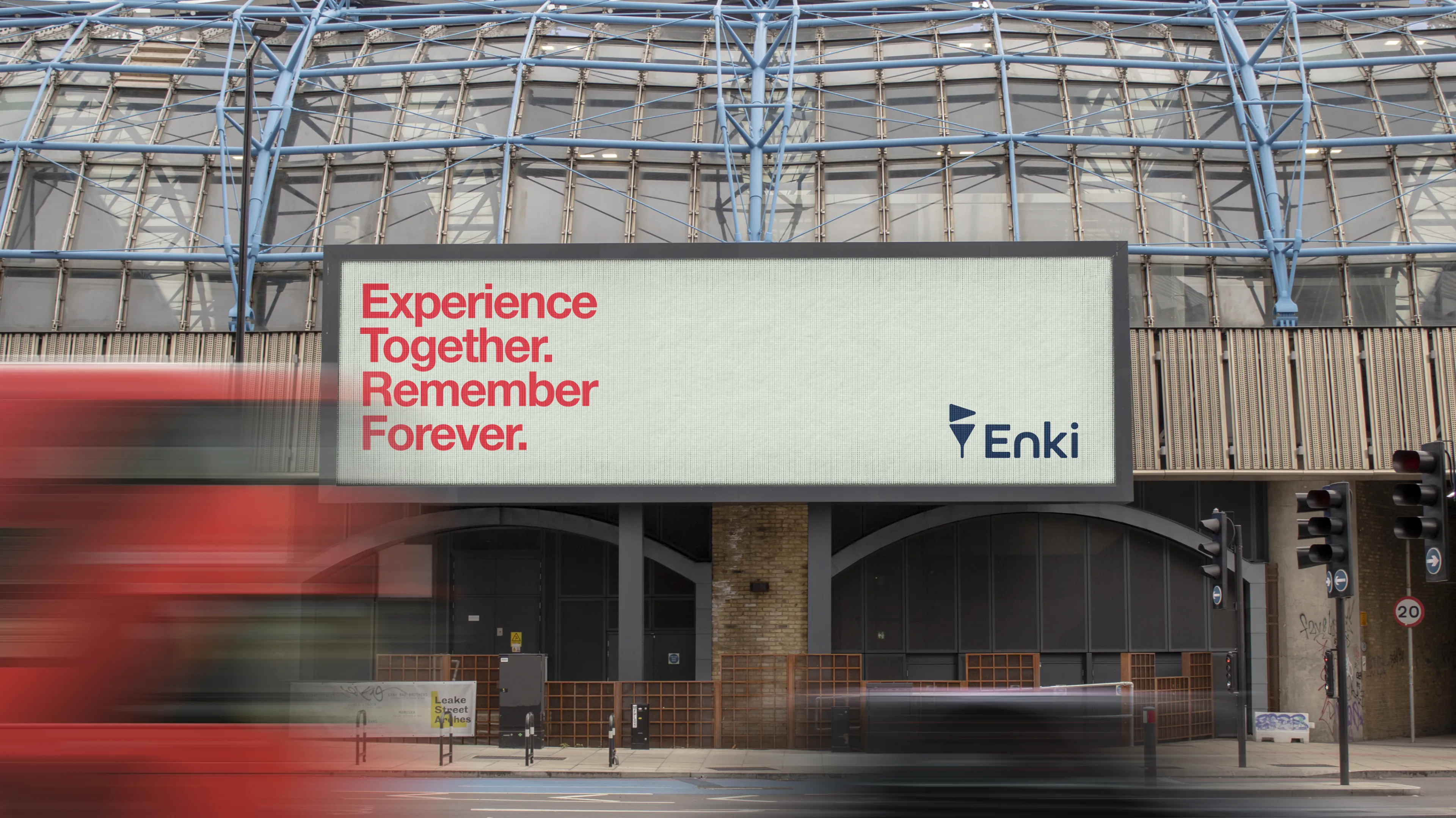
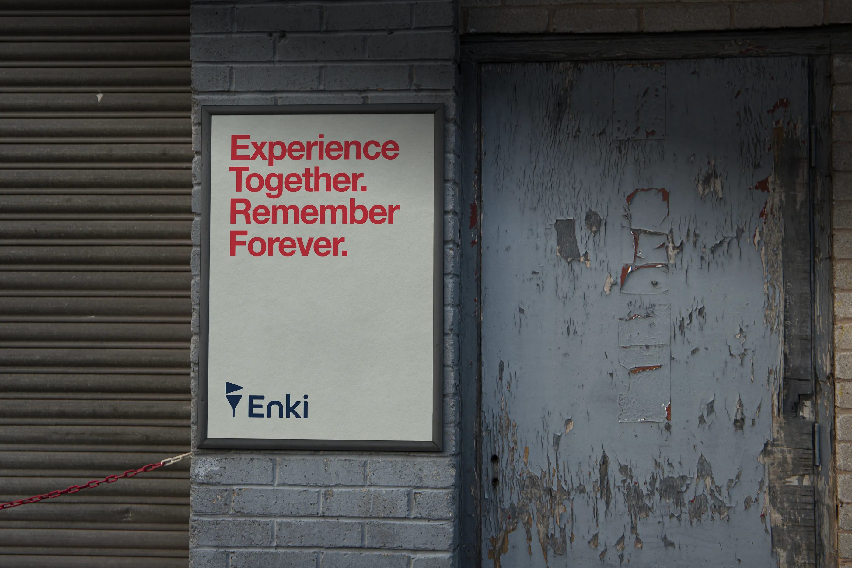
The same mark scales from a phone case pattern to an app icon to posters and billboards, with a voice to match: short, confident lines about culture and community.
The guide
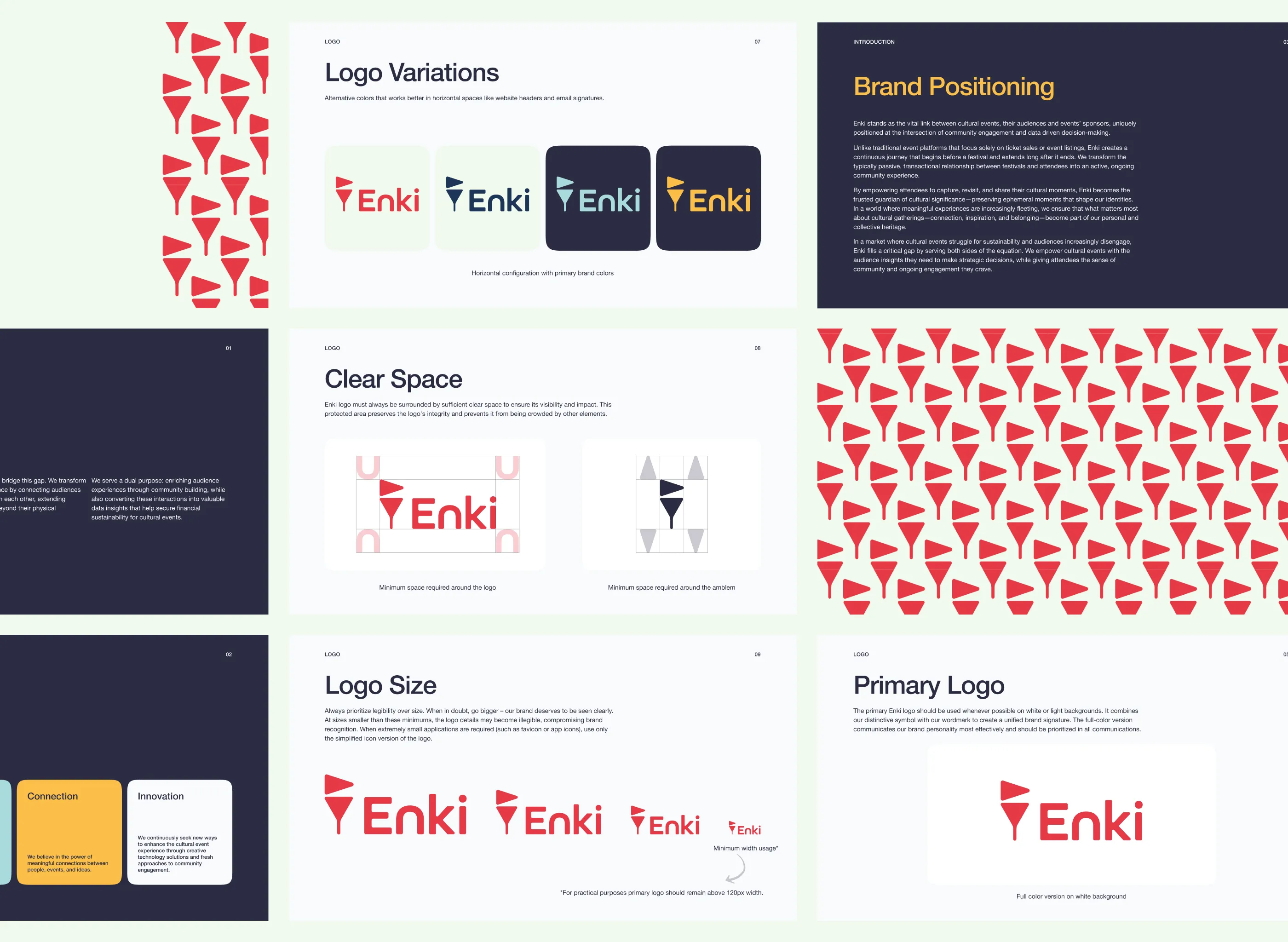
A full guideline locks the system down: core values, logo sizes, incorrect usage, type scale, and color rules, so the identity survives other people's hands.
Reflection
Brand identities usually chase a feeling and leave the details to whoever comes next. Enki flipped that: contrast ratios, misuse rules, and type scales were part of the identity from day one. It confirmed something I keep relearning: a brand isn't what you design, it's what survives other people using it.